Monday, November 15, 2010

Millersport Highway Houses

The cookie cutter houses of the Millersport Highway suburbs appear to be representative of the "little boxes" described in the song bearing the same name. I listened to this song and found it to be extremely relative and even pretty enjoyable. It really captured what the typical American view of society looks like based on these neighborhoods.

Cape Cod style "Little Box"

These houses are all very similar. They have the same architectural stylings-- small steep roofs, symmetrical windows with the door in the center, and 1 and 1/2 stories. They are probably sitting on the same amount of land as well. Just like other aspects of American society they seem to be conforming to societal values. In fact, the entire neighborhood is patterned out in an equally segmented area, so that everyone can have their little piece of the American dream.
Some people have a little more money than others as you can tell by the size of the houses within the same neighborhood. However that doesn't make these neighborhoods diverse in appearance for some reason. Even the ranch style houses, and the raised ranch style houses and split level ranch houses, all look the same. Of course none of these houses look EXACTLY the same. The owners have decided to make them differ some how. Or as Dolores Hayden eludes to, probably the builders of the house more likely made the houses differ, to appeal more to people.  After all, nobody wants the same house as someone else. Maybe it could be a different color or have some different visual asthetics. Whatever the case the houses pictured above and the ones pictured below are very conformist and similar in the way they are built. 

 "Don't tell me that my house looks exactly like my neighbors"

Hayden's idea of the three part promise of the suburb is represented in this neighborhood just off Millersport Highway.  Although they may sacrifice some on the side of house size and nature access, the people here do reside in a nice, quaint, little neighborhood.  I'm sure everybody knows everybody and that probably adds a sense of neighborhood togetherness and security. In fact, when I was driving through this and other neighborhoods in close proximity to this one, I was probably looked upon as an outsider. I'm sure that people in this neighborhood did not appreciate me stopping near the curb and snapping pictures of their houses.

Different Pictures, Same houses...


Wednesday, November 10, 2010

Queen City Downtown

Last Friday I opted to take a tour of Downtown Buffalo.  Of course it was raining and windy! Anyway I really enjoyed my tour and so now I would like to share what I learned.

 
This magnificent building is the Market Arcade building.  You can see that it has an extremely elaborate facade with a buffalo right above the door. It was designed by E.B. Green, who is a very prominent architect of the downtown area. The Market Arcade building use to be an indoor mall in its heyday, which was around the turn of the 20th century. There use to be an outdoor market outside of the building but the inside is full of small and numerous window shops with big plate glass windows that make it easy to display merchandise to would be comsumers, as you can see from the picture below.


When the train system was built down through this area this mall and many other buildings were left in decline.  Many businesses here were moved to the surrounding suburbs.  It has since been a struggle to renew this area to its former glory. The Market Arcade now serves as part of the visitor center for the Preservation of Buffalo-Niagara. It was where I started my tour so it kind of served as an appetizer for the rest of my experience.  Below is a picture of the above-ground portion of the metro that comes down after the car-portion of main street ends. My tour guide let his feelings be known clearly to me as he said that the train system was one of the worst things that could happen to this area. He grew up in the downtown area and he said that the train system caused a lot of stuff to fall to the wayside during its construction.


This art-modern style building is called the alleyway theatre.  It has a very retro design as you can see by the rounded corners and windows of the building and also by the smooth surfaces. Inside of the building shows the same technique. 

This theatre used to be a Greyhound bus station. In the alley, shown below, the buses would come through and pick people up from the ticket office, also below.  The alley is actually how it got its name. 

We then stopped at Shea's Buffalo Performing Arts Center.  This is the most beautiful, ornate theatre of which I've ever been inside.  The inside is all marble and it has Tiffany's chandeliers. The theatre part of this building holds around 3,000 people on the floor and balcony. My tour guide emphasized that Shea's Buffalo is what draws the suburbanites into the city. Below is a picture of the interior of the lobby at Shea's Buffalo.

After this stop we walked over to the M&T Gold Dome Bank and the Electric Tower (both below). The inside of the bank was amazing. It looked like it was straight out of a movie.  All that I could think of once inside was the bank scene of The Dark Knight. Actually, my tour guide said, not too long ago, Keanu Reaves was doing some filming for a new movie about a bank robbery in this very bank! This building also impressed me with the marble interior.  On the marble itself, near the top of the dome, was a miral painting of why Buffalo was/is an important city. As I couldn't take pictures inside the bank, I think the miral was about power, industry, agriculture, and arts/history. My tour guide emphasized that the city is really trying to push the arts/history as a way to draw people back in.
 The Electric Tower was a very cool building. It was designed after one of the non-permanent buildings of the Pan-Am Exposition held in Buffalo in 1901. The Pan-Am Exposition not only showcased the power of electricity and new technology such as X-ray, it probably helped Buffalo become rather imfamous for a while as it was during this exposition that President William McKinley was assassinated.  Subsequently, this also allowed for Pres. Teddy Roosevelt to take his oath in this city.

After a walk around the architecturally mind-blowing governmental part of downtown (below),

Buffalo City Court- Brutalism
 
Buffalo City Hall- Art Deco


Buffalo Federal Court- Very Modern and actually curves to adhere to the street


we stopped at the Gauranty building, which also blew my mind.  This building really speaks for itself. It is so amazingly elaborate that I took about 20 very similar pictures of both, front and rear, facades of the building. I also took some pictures of the inside as well.
The inside of this architectural gem matches the outside. Even the back, underneath part of the stairs is very detailed.

Buffalo should be considered one of the most historical cities in the U.S. The historical value of just the downtown is immense. It has very rich architecture and almost every building I went to has its own unique story. This tour was amazing and very fun, although it was raining and windy the whole time! I suggested to the tour guide that maybe people do want to come back to the city and enjoy what it has to offer.  Ignoring all of the current economical problems though, maybe its the weather we outsiders dislike.

Monday, November 1, 2010

Housing Styles of Tudor-ville and the Georgian Avenue

Coming from North Campus heading to South Campus on Niagara Falls Blvd I turned right.  It led me into a bunch of different neighborhoods where I could not really assess the housing type.  Just a lot of smaller cookie cutter type houses that everyone bought to have their own slice of the "American Dream."


I travelled over to Englewood Avenue which by chance led me to Cortland Ave, which then led me to some side street neighborhoods unknown to me. 

I went down and around this area and did some exploring of the different housing types and I found some interesting things.
I encountered a lot of different but very similar houses using the "Tudor Revival" style. 


I found 3, 2-1/2 story houses within a couple lots from each other, that looked like they were built around the same time period and owned by the same class of people, most likely middle class.  After perusing through realtor.com, my guess is that they were built some time between the 1960s and 1980s since they looked fairly new and unweathered on the exteriors, and also because other houses in the areas dated around mid 1960s.


What makes these "Tudor Revival?" Well for starters the facade of the houses were mostly a split level, half timbred style that was only somewhat different among all three houses I photographed. The half-timbering, you could tell, was purely ornamental and held no strucural value. They all had some sort of gothic feel to them with the darker color scheme. These houses also had an assymetrical design that was readily noticeable. The gables of the roofs were overlapping and jutting out from each other. The roof itself was steeply pitched and so was the roofing over the dormers. The long narrow windows also fit the mold of Tudor. Upon zooming in, the photo reveals the plank door with diamond pane windows  that also shouts "Tudor!" This house above also has the Tudor arch entryway.  

Pardon the stop sign but heres one more example.


On the other side of the street was this masterpiece "Colonial."
What a pretty house! To me this was the best part of my adventure today.
I think this house probably fits the "Georgian" or "Colonial Revival" type. Mainly because of its symmetry of the six pane windows and how the paneled door is the most prominent and ornamental part of the facade. The architecture of the door was really neat.  It boasted elaborate entablature which included tooth-like dentils, decorative pilastors (flattened columned supports, greek in style) and even a crown like cap. This house had a symmetrical hipped roof that I thought looked really cool with its dentil carved underside.
It may be just my opinion but owning this house says, "I want what everybody else wants but I want mine to look better."  
A house similar to this one and in close proximity is from 1963 and is selling for about $147,000. Thats not a hefty price tag in these hard times, but maybe still out of range of many working class families like mine I'm sure.  Its probably owned by a white collar middle class family that has jobs in the city or suburban offices or something "American" like that, as it embodies ideas of tradition.

These two architectural styles seemed to dominate this area. Again I must reiterate that I feel it was a traditional middle class neighborhood and that maybe most of these people worked in the city but wanted to own their own house outside of all the chaos. This neighborhood is a short distance from some of the nicer looking schools, and has access to many surrounding ammenities such as parks, resturants, and stores within a couple miles. Its approximately a 15 minute drive from downtown Buffalo (perhaps where they work). It seems like the perfect place to live and raise a family. 

Tuesday, October 19, 2010

What the Old and New Worlds Have to Offer


As an American I could think of a many places in the world that I would like to go.  At the top of my list, I would have to say, sits Venice, Italy.  Then I would like to visit Paris, France, and London, England.  So I checked out some brochures and found one with my so called "dream" vacation and it was entitled "From Rome to London."  This vacation includes the very cliché notions that the old world is rich with culture and beauty that Europe has to offer.  Travel in this vacation would include visits to Rome, Pisa, Florence, and Venice, Italy and quick stops in Austria and Switzerland before heading to Paris, France and finally London, England.  This vacation is designed to leave American visitors in awe of the beauty of the "old world" culture.  You would be able to see mind-blowing sights from the "mighty" Colosseum, to the Leaning Tower of Pisa, and a palace and many city squares (don't forget about the famously romantic canals!) in Venice.  In the brochure, Venice is said to be "more like a marvelous film set than real life" obviously playing off the rich culture of such a picturesque destination.  After enjoying the beautiful art, culture, and architecture of Italy, the American traveler would then travel to Switzerland to visit Lake Lucerne and take a cable car ride up a 10,000 foot mountain in the Swiss Alps.  A visit to Paris will enthrall the American traveler with visions of culture, whether its tasting wine and enjoying a Paris dinner or visiting remarkable sites, such as the Eiffel Tower, Louvre Museum, or nearby château de Versailles.  The vacation ends with London, England.  You would make arrangements for a flight home and meanwhile see what the city has to offer by perhaps seeing Parliament and Big Ben.


     European package tours are designed to leave people in awe of the beauty of the many famous places that the rich landscape of this continent has to offer, whether it's man-made or by nature.  They also let travelers get a taste of Europe figuratively and literally with visits to art museums, highly-rated restaurants, and architectural marvels and so on.  Many destinations of European tours offer a view of such a long-standing tradition and customs. These are difficult to get a feel for in America because of Europe's long and eventful history.


      European travelers to America on the other hand enjoy what our country has to offer with tours such as "New York, Niagara Falls, and Washington, DC."  This tours plays off the amazement of travelling through New York City, where tourists are urged to "explore" what the city has to offer.  This suggests that NYC is so large that one could not help but find many interesting things to do and see.  Next up is the motor coach ride through New York State where travelers can witness the beauty of New York's forests and country sides.  Niagara Falls is the destination.  It is a destination on many American tourists' lists as well.  Here one would be awe-struck by the beauty of what some consider one of the Natural Wonders of the U.S.  A tour on the Maid of the Mist would suffice in stimulating one's senses for the day.  Then it's off to Philadelphia, after witnessing miles and miles of natural and man-made landscape, to entice the visitor with a sense of the historical founding of this country.  The final destination of the trip is Washington D.C. to get a better sense of history.  One could see one of several war-memorials, the national cemetery, museums, monuments and governmental buildings.

     American-package deals as are sold to Europeans seem to play off our countries short but rich history, as well numerous architectural buildings and natural beauties that the U.S. has to offer.  Ideas of busy bustling cities and post-card worthy country sides come to mind when viewing the brochures that offer Europe an experience of America. This is somewhat of a cliché notion but it is rather true. America's short and diverse history and multi-culturist values have created an interesting landscape that is most likely appealing to all people of the world, not just Europe.


-Brochure info via Cosmos.com and pictures from Google.com/images


Monday, October 11, 2010

Urban Panoramas: Comparing NYC to Tokyo, Japan


     New York City seems to be a pretty segmented city, as if it has very extensive and pervasive zoning laws.  As you can see it has an enormous array of sky scrapers in a densely packed area in the center city.  But surrounding the central high rises are tons of crowded low rise dwellings.  They reach as far as the eye can see!  By poking around the internet and viewing various images, New York and Chicago and Philadelphia all kind of look the same.  It seems to be distinct of American cities to have such a dense concentration of high rises in one central area of the city and have surrounding neighborhoods outside of that circle.  The aspect of shiny bright sky scrapers really showcases the city in a glamorous light almost as if to say “this is what we have to offer.” This could also help to minimize focusing on the inner city slum areas. Society prospers in these districts and this is possibly why they are the most refined looking and hence better functioning parts of the city.


     In contrast Tokyo, Japan looks as if high rises and low rises are all jumbled together in a super-tightly packed metropolis.  I read an interesting article about the planning of Tokyo and found out that Tokyo’s design is basically a redevelopment. Since Tokyo was heavily destroyed in WWII, it was built essentially on top of those ruins. I also learned, and after looking at the picture it is clear, that Tokyo has a mixed-use zoning pattern that allows it to look like an urban mess but function like a continually changing and adaptive city. In a place that boasts the title of the world’s most populated metropolitan area, Tokyo needs this adaptability to take on the demands of so many people. Tokyo utilizes this mixed-use zoning to keep in place the culturally important family businesses and small-scale industry. Because of this, Tokyo keeps its important sense of culture and avoids the social segregation that is SO apparent in American cities. Tokyo maintains social cohesion by “mixing” upper and lower classes fairly seamlessly in the same areas whereas in America these classes are separated by different segments of the city making it harder for different classes to mesh together.

-Article where I got info about Tokyo and its urban planning--http://www.urbanology.org/dharavi/The_Tokyo_Model_of_Urban_Development_Echanove_1.7.07.pdf
Photos are from wikipedia.org

Monday, October 4, 2010

How Ethnicity Shapes Landscapes: Little Tokyo, Los Angeles, California

For this particular assignment I chose to discuss Little Tokyo in Los Angeles, California. Although not many Japanese people live here and it is not primarily a residential area, this part of Los Angeles thrives on tourism of Japanese and non-Japanese people from all over.

This part of town is part of a redevelopment of Japanese culture in an attempt to restore the area to its original Japanese heritage. Little Tokyo would fall under the 3rd type of ethnic landscape patterns in America as its development-- re-development, rather, is a little after the fact. Not many Japanese people live here in the present because they were forced into internment camps during WWII. After Japan’s infamous attack on Pearl Harbor and the subsequent racial tensions that followed many Japanese people were forced out of this and other public areas of the United States.  Many Japanese people have since settled elsewhere, predominantly into surrounding suburbs. Little Tokyo was later threatened in the late 1960s by the rapid growth of the surrounding aspects of the city. Left to historical neglect and dismay, Little Tokyo was helped out by the mayor and became part of a project known as the Little Tokyo Redevelopment Project. Under this project there was funding for many buildings which would symbolize the Japanese’s ability to overcome obstacles to find their place in American Society (Michael Several, Little Tokyo).


Some of the buildings that are part of this redevelopment project have a very distinct Japanese styling to them. Like this fire lookout tower known to the Japanese homeland as yaguras; this is Japanese for tower or turret. Picture below.
(Photo from <http://media.discovernikkei.org/articles/3497/little-tokyo-yagura-2007.jpg>)


Other very typical pieces of Japanese architecture are this Buddhist temple and this Torii gate (respectively pictured below). These structures both embody Japanese religious values and have great importance in the redevelopment project in order to revamp the area of Little Tokyo and provide historical significance.

(Photo from <http://www.flickr.com/photos/cityprojectca/855386366/sizes/o/in/photostream/>)


(Photo from <https://blogger.googleusercontent.com/img/b/R29vZ2xl/AVvXsEhJ8O8Qdm0L3b9M3ZP1NEAiCFPym_Crxpgvzu6Gi-f_G03IkRi4DLLYziqi75wRHLjxoiPu3-HBRQrutWMTUGInf61S_j04i0TQmUwhZQJmHfJE-DaCeQzVs73B3b4JczzeRvjWbX3PtAEq/s1600-h/little-tokyo-facade.jpg>)


There also tons of pieces of Japanese art that are publicly displayed throughout Little Tokyo.

For example, this is a sculpture of an origami horse in front of a bank in Little Tokyo. Although not created by a Japanese person this sculpture is based distinctly on the Japanese folk-art style of origami.
(Photo from <http://www.publicartinla.com/Downtown/Little_Tokyo/origami_horse.html>)


Want to find an authentic Japanese restaurant? Look no further than Takumi Restaurant. This authentic Japanese restaurant lies within Little Tokyo in LA and serves up sushi with a side of traditional Japanese atmosphere.


Little Tokyo is full of Japanese influences such as Japanese style art and architecture, building names, bilingual atmosphere, and many restaurants that try to bring in tourists and let them get a glimpse of how Japanese influences, through recent redevelopment, have shaped this section of the city of Los Angeles.


References-

Little Tokyo Historical Background: <http://www.publicartinla.com/Downtown/Little_Tokyo/little_tokyo.html>

Wednesday, September 29, 2010

Street Environment Project: Municipal Trash Cans

GARBAGE CANS- PRESENT TIME

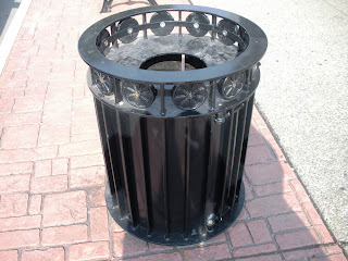
Use:  Street garbage cans are usually placed in high travel areas and are used for encouraging people to throw away their trash. Trash cans provide a healthy alternative to littering and help to keep the Earth cleaner and healthier. The trash we throw away is taken to a landfill, incinerated, or recycled to make new products.

UB Trash Cans-
Scarborough design; bought from Landscape Forms, Inc.


Advertisement from seller: (Yes even trash cans need to sound appealing to the consumer!)

The Scarborough can is employed in active urban settings (such as UB) because of its aesthetic modern appearance and also because of its sustainability. These garbage cans go well with other street furniture. For example, these are usually paired with Scarborough benches made from the same company (Picture Below). These receptacles are made of recycled metal and are deemed by Landscape Forms to be 100% recyclable (Landscape Forms website)


Trash Cans from Main St.
Trash cans are considered street furniture. As with the furniture in your house you would ideally like it to match the other furniture. These next pictures are no exception to this idea. The first set of pictures I took was in front of Talking Leaves Bookstore. You can tell whose trash can this is when you look at the leaves painted on the can itself. They correspond to the leaves all over the Talking Leaves storefront.


These next images were taken near the Steer restaurant on Main St. near South Campus UB. The bench and the garbage can are actually manufactured by the same company. This is similar to the garbage cans and benches on North Campus UB.


A Trash Can From Miami
 
(Photo from <http://miamieverydayphoto.blogspot.com/2009_02_01_archive.html>)

 
This is a trash can from Miami, Florida. Now obviously the city doesn’t want these tipped over and trash thrown everywhere when a hurricane comes rolling through. That’s why these are made of concrete.
Interestingly enough Miami has one the most technologically advanced waste-to-energy plants in the world. It takes the trash we throw away and incinerates it to make energy for the equivalent of powering 40,000 homes. The trash that would normally go to the landfill then becomes only 10% of its normal volume in ash form and is dumped in to an ash landfill (http://www.miamidade.gov/dswm/).


Trash Cans From Elsewhere in the World

Japan
(Photo from <http://greenz.jp/en/2010/07/21/incineration-in-japan/>)

Garbage cans in a Japanese subway station. They are clear because it’s easier to detect things that should not be put in there (like bombs!)  
The transparency safety effort has also been introduced in other cities throughout the world such as Paris, France.
On an interesting side note, from what I have poked around on the web about trash cans around the world, Japan seems to be the only place that I have encountered people complaining about the scarcity of public trash cans (http://new2japan.com/garbage/).


Amstelveen, The Netherlands
(Photo from <http://www.expatcenter.info/aspx/read.aspx?xdl=/views/amsterdamnl/xdl/page&VarIdt=186&ItmIdt=126512>)


Paris, France
(Photo from <http://commons.wikimedia.org/wiki/File:Waste_Container_Plastic_Bag_Paris_.jpg>)


Lausanne, Switzerland
(Photo from <http://commons.wikimedia.org/wiki/File:Recycling_bin_Lausanne_mp3h7756.jpg>)


Taipei, Taiwan
(Photo from <http://commons.wikimedia.org/wiki/File:Taiwan_2009_Taipei_Waste_Containers_throughout_Liberty_Plaza_with_National_Theater_in_background_FRD_7440.jpg>)


Other Present Uses for Trash Cans:


Advertisements-

 A way to get the word out about your company or to get your name out to voters.
(Photo from <http://www.brooklynpaper.com/stories/31/38/31_38_sp_yassky_cans.html>)


Food Sources-
We would not eat this stuff but it makes great food for some animals.
(Photo from <http://commons.wikimedia.org/wiki/File:Raccoon_getting_in_trouble.jpg>)


(Photo from <http://www.alaska-in-pictures.com/bear-with-garbage-can-4134-pictures.htm>)


THE FUTURE OF GARBAGE CANS

Solar Powered Trash Compactors

(Photo from <http://www.phillydesignblog.com/2009/05/big-belly/>)

Solar powered trash compactors are already in use by cities like Philadelphia, PA, Pasadena, CA and even universities such as Georgetown University and Arizona State University

Why? 
Because these are easy to use and compact the trash inside so that waste removal doesn’t need to happen as often. Therefore municipalities save money that they can use toward other city projects. As Liisa Rajala, from USA TODAY explains it: “A growing number of cities and municipalities are testing solar-powered trash compactors as a way to go green and save some green” (<http://bigbellysolar.com/usa-today-trash-cans-dumped-for-sun-powered-compactors/>)

How do they work?
When the bin inside gets full, the compactor crushes the garbage inside and makes room for more trash. When this can reaches its full capacity it sends a text message, via its wireless capability, to the department in charge of picking up this bin. This is all done using solar power.


Self-Emptying Pnuematic Trash Cans
(Photo from <http://gellersworldtravel.blogspot.com/2010/06/shanghai-expo-2010-few-more-photos.html>)

These “green” trash cans take the collection problem out of recycling. They are designed to pump garbage via underground tubes to the recycling station nearby and eliminate the need for trash pickup all together. These are planned to be used at the Shanghai World Expo 2010 which currently runs from May 2010 to October 2010 and where the theme is “Better City, Better Life” (<http://english.cri.cn/6909/2010/01/22/195s544411.htm>).

Of course these are great for the environment, but one of the main concerns about these new pneumatic trash cans is that they pose a threat to the men and women who come to pick up the trash we throw out. Like robots in car factories people again will be replaced by technology.